Minnesota Youth Jazz Bands - Website UI Redesign
UX / UI Design Project Case Study
Overview
MN Youth Jazz Bands is a small organization dedicated to helping kids learn and experience jazz.
Each year they bring students from around the metro area together to rehearse, perform a live show, and even record music in a professional studio.
The MN Youth Jazz Bands website looks like an antique. The interface probably hasn’t been updated since 2009 and probably wasn’t even very good for at that time. Beyond looking old, the site had zero functionality that could improve or assist the program. We asked ourselves:
“How do we connect our organization’s instructors, parents, and students? Our redesign of the Minnesota Youth Jazz Bands’ website attempts to engage and bring together its three core sets of users.”
I worked on this project with Elizabeth Wilkenson and Kent Bogdan
Problem
The Minnesota Youth Jazz Bands’ website’s aesthetic and content are extremely out of date. The site doesn’t have basic modern features and interactivity.
Solution
Update the look of the site and give it a consistent, modern look while making it possible for parents and students to connect with their instructors with their own individual portals
Tools Used
Figma
Miro
Illustrator
Photoshop
Google Office
Role
UX Researcher
UX Designer
UI Designer
Timeline
Two weeks of research and ideation
One week of prototype design
One week of visual design
Before
This is what the site looked like when we started this project
After
This is our completed prototype
PHASE 1: Research & Analysis
Proto Persona
After some initial digging through the organization’s website, we developed our proto-persona. We know that the program’s participants are middle and high school-aged kids, but we assumed that they’d need some nudging to get signed up. Our mother wants to harness her children’s interest in music and get them to explore musical activities outside of school. And she’s willing to do the research.
Secondary Research
Some background research taught us a lot about how we might use our site to champion the cause of youth in jazz. When learning music, kids need to have input into how and what they learn. And jazz, in particular, is difficult to learn in a traditional music education setting. Kids need to experience it over and over to learn it. Ideally with a group of other people since improvisation is such a key part of jazz.
User Research
We interviewed parents to better understand how they manage their kids' involvement in activities outside of school. We gathered information from six interviews.
User interviews showed that, when becoming involved in an organization parents expect:
An interactive online space
A clear mission
Inclusivity
High-quality photos
Here are some quotes we pulled from our interviews:
“Being connected outside of class is a must.”
“I want to hear how current participants feel.”
“My child needs access to everything online.”
“If the site isn’t modern and up to date, I’ll think less of the organization. I may discount it altogether.”
“It’s important to me that the group has a good mission and purpose.”
“I need to be able to pay online.”
“Needs more virtual elements. Take instruction virtually. Collaborate virtually. Social media. Get stuff out there in the public.”
Heuristic Evaluation
The header is too small, has no impact, color.
Very low contrast between text and background colors. No clear order or hierarchy
No continuity for logo placement
Information is hard to read, content should be in a separate
Color contrast issues.
The overall layout is dated, nonresponsive.
CTA could be more impactful if used in a different location and linked to easily actionable information.
Information is mostly displayed with text. There’s no real established hierarchy to the design. Not current, but recent enough to show that the site may still be active.
Competitor Analysis
Competitor research showed that, while most other sites were more visually appealing and easier to navigate, not one had the level of interactivity that our users expected.
Sites evaluated: Kansas City Area Youth Jazz, Columbus Youth Jazz, Youth Performance Company
Affinity Diagram
We took our insights from the interviews and sorted them with similar insights to determine which areas required the most focus.
Persona
After analyzing our research results and creating an empathy map, we found it helpful to create a secondary persona. The parents said that both they and their children expected an interactive online experience, and we knew they’d each use the site for different purposes. So we wanted to design for separate purposes.
We’ve got Phoebe, a mom who wants to see her son happily involved in a jazz group (and make an easy online payment). And then there’s Chase, who is very interested in performing music and using tech to learn and share his experiences. Both can use the interactive features on our site to accomplish their specific goals.
Secondary Persona
Primary Persona
PHASE 2: Definition
User Insight
Phoebe, a working mother of two is interested in enrolling her children in a music program where their talents can be developed and nurtured. She wants to consider the MN Jazz Bands website as an option, but feels like the websites user interface is off-putting and, despite having non-profit funding, lacks a clear cause, message, or goal. A better website might make her feel more confident in her decision to choose MN Jazz.
Problem Statement
The Minnesota Youth Jazz Bands organization is passionate about creating opportunities for young people to learn about and participate in jazz music, but has a very outdated and uninformative website with limited functionality. We discovered that, when looking for extracurricular activities, families like to have a lot of information about the group's values and activities. They expect an organization to have a modern, intuitive, and interactive site.
How might we redesign and modernize the site to convey the organization's values, give potential participants a sense of excitement about their involvement, and give parents the information they need to get their kids involved.
UX Hypothesis
We believe that adding a way for students, parents, and teachers to interact more collaboratively while also improving the visuals and the messaging of the website will enable MN Jazz Bands to increase their participation and improve the way the people use the site. We'll know this is true if more users visit the site and participate in the program.
Value Proposition
Minnesota Youth Jazz is creating a user portal to help students and their guardians stay up to date on what's going on in the program, pay their tuition, and connect with the instructor.
We’re better because we have researched what users want from a program and thoroughly tested our solution.
We’re believable because we have the data to back up our decisions.
PHASE 3: Ideation
Feature Prioritization Matrix
We used Miro to facilitate brainstorming and ideation. We used a sort of hybrid “Brain Mapping” method to attempt to generate some ideas. We would put ideas on a post-it note and then try to connect as many ideas together as we could. Once we had those ideas together we looked at how difficult each idea would be to implement.
Features to focus on for this project:
Update aesthetics and modernize the layout of the site
Create a new color pallet
Consistent typography
Upgrade graphics and photos
Overhaul Information Architecture
Make an intuitive sitemap
Add places for new features
Add an interactive student and guardian portal
Allow parents to pay tuition online
Create a space for students to record and share their music
Storyboard
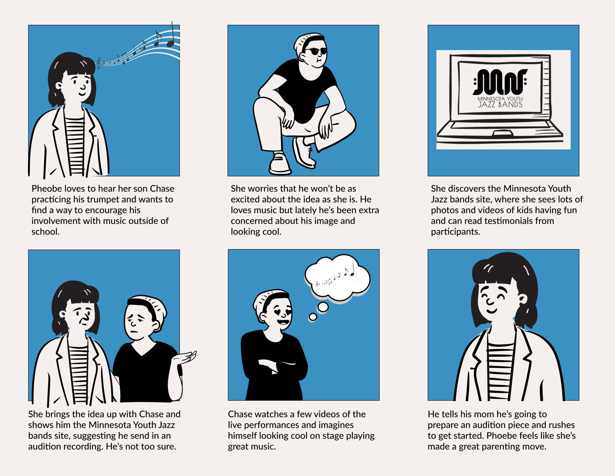
To better tell Phoebe and Chase’s story and how the new MN Jazz Bands website would help them we created a storyboard showing their journey.
PHASE 4: Prototyping
Information Architecture
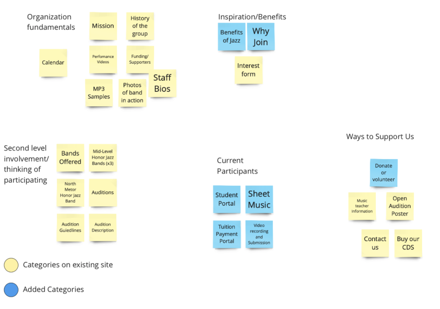
We used Card Sorting to figure out the best way to organize the navigation items in the prototype. We were able to organize information into a more intuitive layout.
We prioritized the student portal feature and also simplified the navigation and the naming structure, especially the “our bands” section, which provided confusing information
User Flow Diagrams
We created user flow diagrams for each of our personas since they were each going to use use to portal in different ways. Phoebe would use the portal to pay tuition while Chase uses his to send videos and questions to his instructor.
Paper Wireframes
Wireframes
Desktop
Mobile
We had to make sure the website was responsive so we made sure to create a prototype of how the website should look in a mobile version. The final version of the website looked a little bit different than this, but working with Bootstrap for the first time gave us some trouble.
Portal
Guardian Portal
Student Portal
UI Style Guide
We chose a new color palette based on the colors used in vintage jazz posters. We went with a dark green as a secondary color to contrast with the vibrant orange. We also completely redesigned the logo. The new logo is meant to invoke the idea of a sound wave or the valves in a trumpet.
Accessibility Verification
We tested all possible color combinations to verify which combinations would work on the site and which combinations would make our text difficult to read.
Design A/B Test
Figma Prototype
Here is the full prototype version that you can try out. There are two versions for both personas.
Front End Development
We actually created a functional web version of the prototype using Bootstrap, custom HTML + CSS, as well as some Javascript.
PHASE 5: User Testing + Outcomes
Iterations Based on Testing
Some changes we made to the project based on testing outcomes are detailed in the slide below.
Usability Testing
We had a high level of success when testing our designs. You can see the results below:
PHASE 6: Conclusion + Future Opportunities
We accomplished a lot with this project. I’m really happy with how the UI looks. It would be possible to make something more modern and cutting-edge, but I think that over-designing an interface for aesthetic reasons and not for accessibility would only detract from the purpose of the site. By focusing on legibility, accessibility, and enabling the user to control their experience I believe we added a great deal of value to the site.
Next Steps
Some iterations we could make and features we could add moving forward
Complete the front-end development of the student and guardian portal
Design a portal for the instructor side
Add a feature for buying, selling, and renting instruments
Continue to test and iterate on current design
Add a more guided way to show users how to sign up for the program
A way to connect students and send each other videos of themselves playing
Thank You for Reading
More Case Studies
Forest Service
Website UI Redesign
Avalanche
Mobile Travel Application


